Milanote
A companion app to their Web service and at that it's good, has a clean user interface and it's fast. The free plan is too limited, the app doesn't stand on its own and it's too expensive.

Welcome to Episode # 103 in my never-ending journey to find the best Android note-taking app. Before I get into this week's app, a quick welcome.
Thank you for subscribing to my newsletter! Also thanks to a passerby for sending me this message via email:
You have put a lot of work into your reviews, but I can't read them all.
Is it possible to have a top five list and link to the posts for those?
I shared the link to my other site note-apps.softr.app with them since it provides a mobile-friendly index into my reviews, lists the apps from high to low score, provides a summary of each, and a link to each review. I will figure out how to make that site more visible.
This week I played a bit more with Milanote since I didn't post a review last week.
The company behind it has the same name and was co-founded in 2016 by Ollie Campbell who had a background in interactive design and this shines through in the Web app. According to LinkedIn, there are 22 employees.
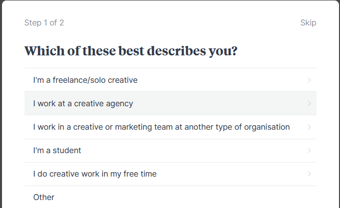
The service is targeted at creatives as you can see from the welcome screen on the Web app.

Some of the positioning:
Get organized. Stay creative.
Milanote is an easy-to-use tool to organize your ideas and projects into visual boards.
Milanote is a tool for planning creative projects.
The Android app is a companion app to their Web service which is obvious once you launch the Web app and see the above dialog.
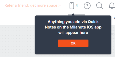
The mobile app is very limited but good enough for taking quick notes. On the Web, they have a special "Quick Notes" section where anything captured in the mobile app is available and then you can drag that content onto a board.
This snippet shows that I had four items created on Android. As I dragged them onto a virtual "board" on the Web app, the counter went down.

They need to update ^ text because it just mentions the iOS app 😄
Once you add items to a board on the mobile app they don't show up directly on the board on the Web. Instead, they're held to the side in an "Unsorted" section and you can then place them on the board.
It's an interesting and unique approach but I wish they made it clear when launching the mobile app the first time as it would set expectations. Because I started on the mobile app, there were no boards nor any way to add a board. If I had started on the Web, it would've made more sense.
Overall, the mobile app is good for quick input. It's got a clean user interface and it's fast, but it doesn't stand on its own that well. Markdown works well on the Web but on Android, it has very limited support. The Android app has no export options, no custom settings, no tags, and no dark mode. It's understandable why the Google Play score is 2.8 stars.
You can get your notes in and out of Milanote for the Web very easily. They export to PDF, Word, and Markdown and all of those work well. I could play with the Web app for hours but alas, my life requires time elsewhere!
Where this app falls down is on pricing. Instead of explaining it, just look at the plans:

That's enough pre-amble. Read on for the ugly, the bad, the good, the great, and the awesome aspects of Milanote.
Screenshots


People
- Michael Trounce co-Founder
- Brett Warren co-Founder
- Glenn Allen Developer
- Isaac Williams
- Mark Clancy co-Founder, Designer, Melbourne
- Ollie Campbell co-Founder
Meta
- Score: 5/10
- Version: 1.3.4
- Device: Samsung Galaxy S23 Ultra
- Google Play rating: 2.8*
- Google Play
- Pricing plans | Milanote.com | r/Milanote
- Released: 2020-05-29
- Location: Australia
Ugly
- No search
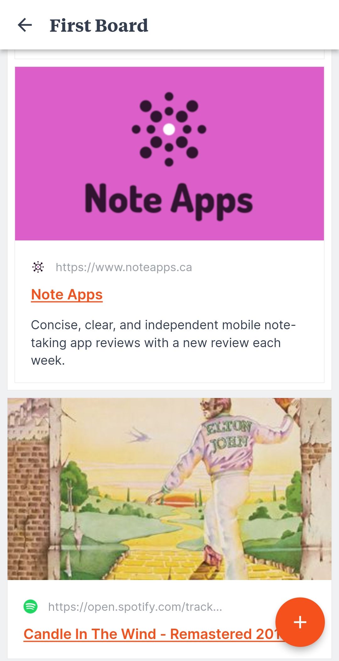
- Only hyperlink, no label or preview if you create from Android
- You have to go into the Web app to create boards before you can use them on mobile
Bad
- Creating a bullet and then selecting a heading you get a Heading on top of a bullet #bug
- No undo or redo
- No tags
- No tables
- Does not autosave, have to click `Save`
- The heading toolbar button only creates a level 2 heading
- Images are separate from notes (except for those created on the Web)
- Can't re-order sections in the app (can on the Web)
- Price
Good
- Text formatting: bold, italics, underline, strikethrough
- Bullets
- Images
- Numbered lists
- Checklists (separate from the notes)
- Indent and outdent
- 3 Heading levels
- Preview mode
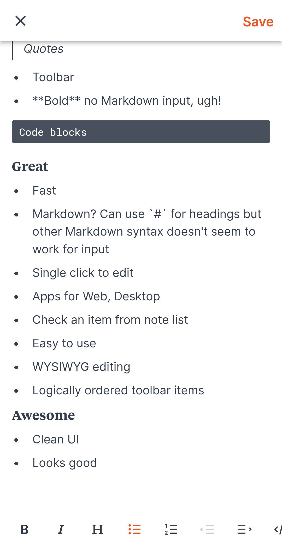
Codeand code blocks- Toolbar
Quotes
Great
- Fast
- Markdown? Can use `#` for headings but other Markdown syntax doesn't seem to work for input on Mobile (does on the Web)
- Single click to edit
- Apps for Android, iOS, Web, Chrome, Edge
- Check an item from the note list
- Easy to use
- WYSIWYG editing
- Logically ordered toolbar items
Awesome
- Clean UI
- Looks good
- Link previews (see Ugly)
- The Web app is very good
In Conclusion
If the company spent some money and time on the Android app and provided better pricing it could be a contender. The Web app is very well designed and fun to try out but not worth the price.
That's it for this week. Have a great remainder of the weekend and a great note-taking week ahead!
