Notedex
Notedex uses a cue card metaphor for the interface. You can put text, images, and draw on cards, flip them around and put content on the back. It's fun to play with but needs a facelift.

Welcome to episode #89 of my whacky hobby of reviewing Android note-taking apps. Before getting into this week's app, a welcome note.
I was contacted by Prem Sundaram back in Feb 2022 asking me for feedback on his app Notedex. Because the app required a login I put it down in my backlog as an option for a future date. He has been gracious and patient with me, and I greatly appreciate that.
Notedex is a Web app packaged inside an Android app and it feels that way. The look and feel leave a lot to be desired. From the first launch with the pixelated icon to the clunky user interface elements and design. Given a facelift, this app could be a keeper.
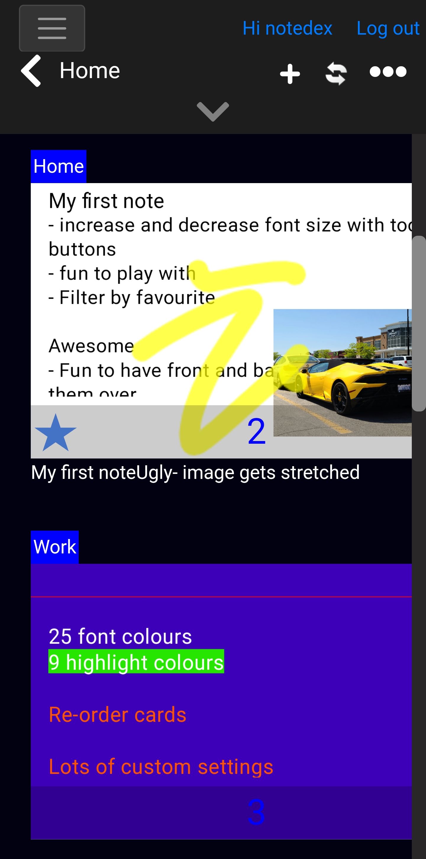
On the plus side, I had so much fun playing with the app this week! It tries to mimic the physical cue cards and makes it fun. You can put text, images, and draw on a card, even flip it around to put content on the back which is great for studying. Moving between cards within a deck is fast and easy. Drawings can be made on top of text or images just like in OneNote.
Cards belong to stacks and you can favourite a specific card within a stack so it shows up with a quick filter which is really smart. You can create groups of cards inside a stack to organize them.
The cards can be shared publicly with or without a password which is nice and you can print them to PDF in 2x2 or 3x3 grids or other layouts. That was a nice surprise.
There are apps for Android, iOS, MacOS, Windows, and Web. The Windows Store app gets 2.5* and I would have to agree. It also appears to be a wrapper around the Web app, not a Windows-specific app and feels that way. Also, changes I made in the desktop app didn't appear immediately on the Web app.
Why Did We Create NoteDex?
"I struggled with apps like OneNote and Evernote since I just couldn't see or find my notes when I looked for them. As a consultant I took lots of long notes and all my information just got buried in (very nice) handwritten notes but were impossible to see or find later.
I realized I needed the ability to take short-form handwritten and typed notes, see them quickly and organize them into projects so I could easily find them later on all my devices . Existing card type apps were too basic and geared towards studying. I needed something that combined the best of both worlds - so I built NoteDex!"
The Web app includes a chatbox "Dex" which I had to try! I asked Dex what tech stack was used and it didn't have the answer, I didn't expect it would. I then asked "Who created notedex?" and got a good answer:
NoteDex was created by Sundaram Applied Technologies and went live on the 1st of March 2006
To give it another try, I asked Dex "Where is my data stored?" and got:
Hi - Yes, we can do text import: Please see this article and video:
https://support.notedex.app/support/solutions/articles/72000592827-201-7-importing-from-text-csv-file
Oh well, Dex has some learning to do.
The pricing is USD 5.99 per month or USD 49.99 per year and there's a lifetime option of USD 99.99. You get 50% off all of these prices within the first week of use which makes it very reasonable!
I'd say Notedex is worth checking out, try the 7-day free trial and if you can get past the 90's look n' feel, you will have a lot of fun. If it got a facelift, I'd definitely give it another go.
Read on for the ugly, the bad, the good, the great, and the awesome aspects of Notedex.
Screenshots

Quotes
An index card style note app for all your thoughts and ideas. Capture, organize, retrieve and share notes across all devices. Supports handwritten digital ink.
Create, organize, share, and print index cards, flashcards, and notecards on all your devices
Meta
- Score: 6/10
- Device: Samsung Galaxy S20 5G
- Google Play
- Web: www.notedexapp.com
- Twitter: @notedex_app
- Last updated: Jan 19, 2022
- Location: Los Angeles, CA
Ugly
- Hardly any usable space to type
- Confusing UI
Bad
- UI looks cheesy
- With the insert hyperlink dialog you have to scroll down to click Insert, same for other dialogs
- Little sluggish saving
- You can't add a tag on the fly, have to create tags and then use them
- Wrong, right, not sure (customizable)
- Got it to hang at saving at one point and had to relaunch the app
- Tag UI could be improved
- No Markdown support
- Not local first
- Export to text doesn't respect newlines (all text is combined)
- Selecting cards UI overwrites other UI elements
- Last updated 1.5 years ago
- No export to Markdown
Good
- Bullet list
- Numbered list
- Indent and out-dent
- Hyperlink
- text formatting: bold, italics, underline, strike-through
- Bullets
- no Markdown support
- 12px to 60px font size
- 42 fonts and lots of good ones
- Toolbar
- Duplicate a note
- Favourite a note
- Copy note text
- Add images and drag them around
- Change the background colour but need to make sure to then change the text colour
- 25 font colours
- 9 highlight colours
- Re-order cards
- Lots of custom settings
- Export to text
- Undo and redo
- Superscript and subscript
- Toolbar button to add special characters
- Sans Serif Pro
- Archive a note
- Fun chatbot "Dex"
Great
- Drawing - would be great for tablets or the Samsung S23 Ultra I want to buy!
- Apps for Android, MacOS, iOS, Windows, and Web
- Great Tutorial page
- Tables
- Increase and decrease font size with toolbar buttons
- Fun to play with
- Filter by favourite
- Export to a set of images in a ZIP
- Study mode
- Card colours
- Each card can have a different font and within a card, you can use different fonts
- Export the front or back of cards only
- Text import
- Show the front or back of all cards
Awesome
- Flip cards over to put content on the back
- Export card as image
- Drag image anywhere
- Export / create a PDF from a stack of cards (notes)
- Lots of export options: 2x2 or 3x3 grid, one-per-page or multiple
- Swipe right or left to go between cards
- Drag and drop notes to re-organize
- Share a note and let the other person edit it
